
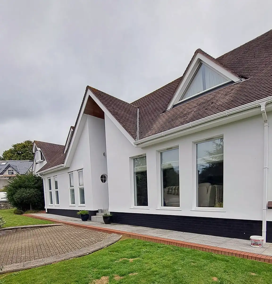


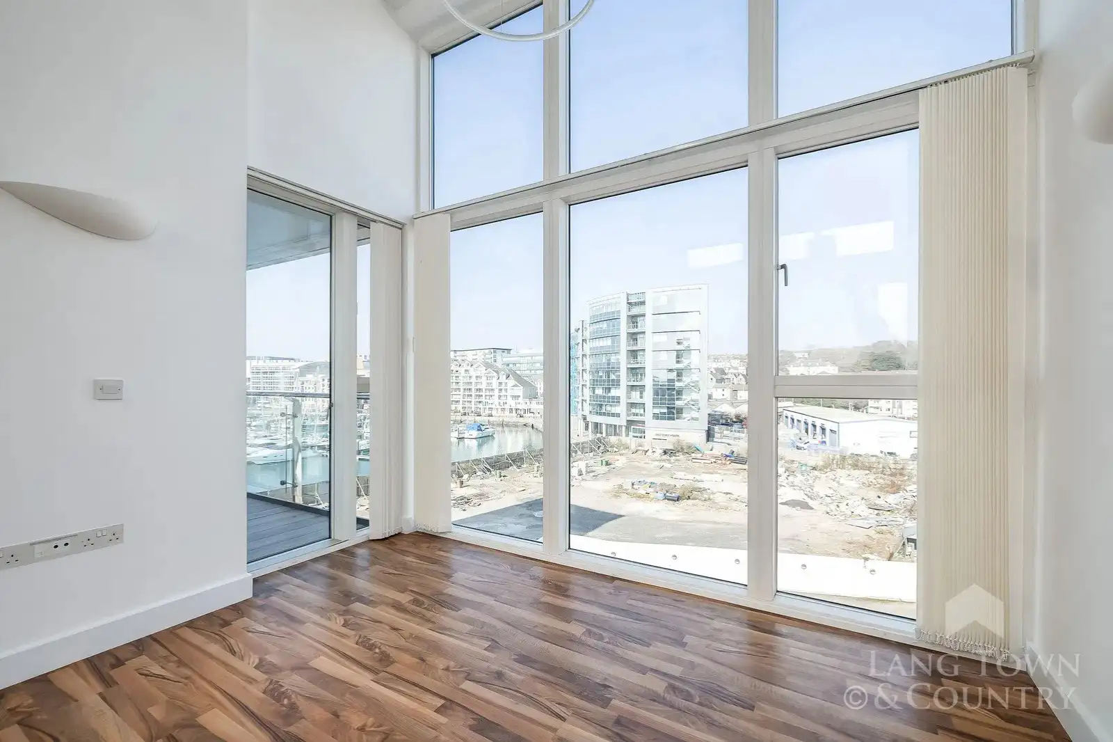

Most people pick colours room by room, but the homes that feel calm, balanced, and well designed almost always follow a bigger plan. The idea of colour flow is simple. Every room should have its own identity, but the colours should still feel related as you move through the property. When this is done well, the whole place feels more spacious and more considered. When it is done badly, the house feels jumpy and disconnected, almost like each room belongs to someone else.
Understanding colour psychology also helps you decide how a space should feel long before you decide on a shade. Some colours lift the energy of a room. Others invite calm. Some create a sense of focus and grounding. Once you know the mood you want, the right palette becomes much easier to choose.
Start with the way your home is used
Every colour decision should begin with a simple question. What happens in this room? A bedroom needs a different emotional tone than a kitchen. A busy living space needs something different again. Once you know what the room is meant to support, you can decide whether the palette should lean warm or cool, bold or gentle, bright or muted.
Hallways and landings also deserve attention because they link every other space. They are often treated as an afterthought, yet they carry the responsibility of tying the whole palette together. A strong neutral or a gentle warm tone works well here because it supports a range of colours in the adjoining rooms.
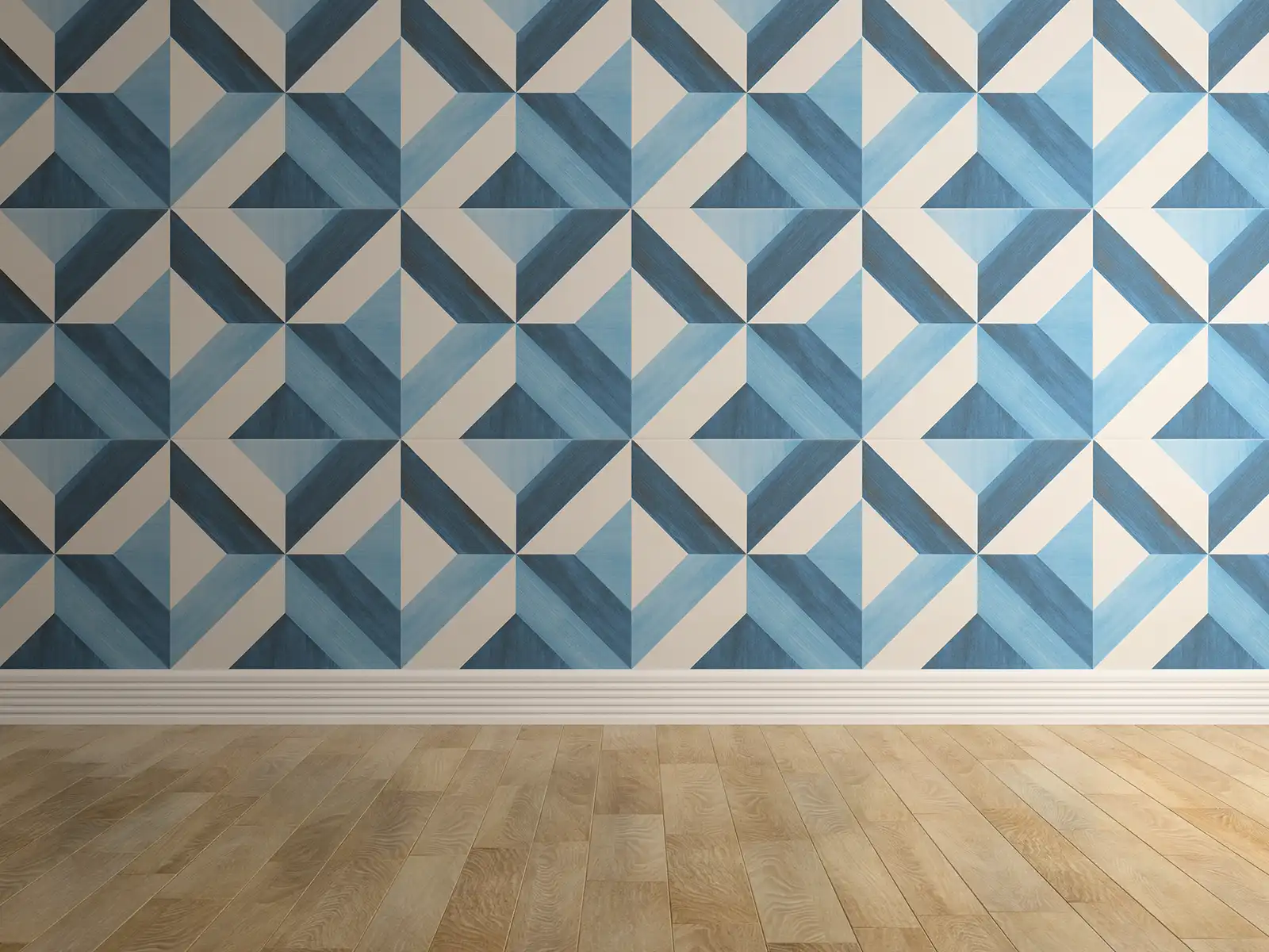
Colour pallets
Light shapes colour more than you think
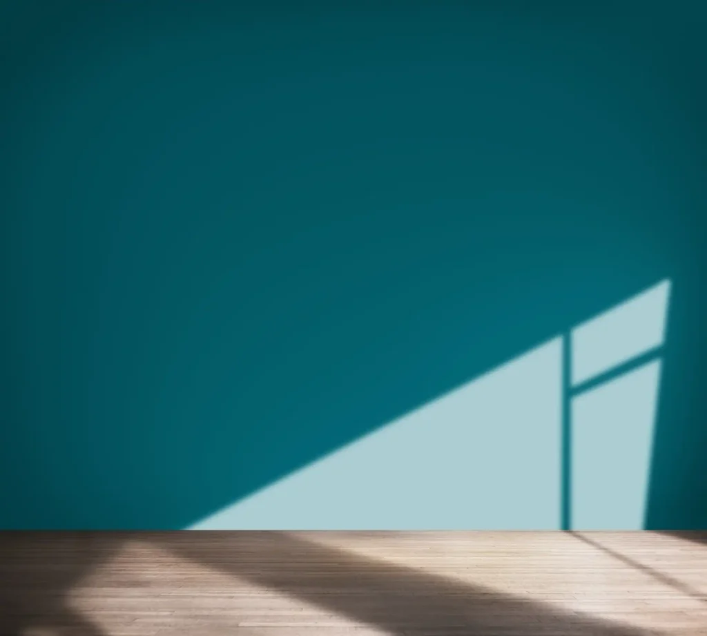
Natural and artificial light can turn one colour into several different versions throughout the day. A warm beige looks peaceful in soft morning light but becomes richer and deeper at dusk. A cool blue can look elegant in a bright south facing room but can appear cold and withdrawn in a north facing one.
Before settling on a shade, paint sample patches on more than one wall and look at them across the day. You cannot judge a colour from a tiny strip of paper in a shop. Let the light of your home make the final decision for you.
Choose one base colour that anchors the whole property
A coherent home usually rests on a single supporting neutral that appears throughout the space. This does not mean every room needs to be the same. It simply means the palette has a backbone.
The base colour is usually found on the main walls of the hallways and the largest open areas. It acts as a bridge between rooms and allows the surrounding colours to change without creating a jarring contrast. Warm neutrals such as soft oat, cream, mild caramel, or light stone work beautifully because they feel natural and timeless.

Create flow by repeating tones and undertones
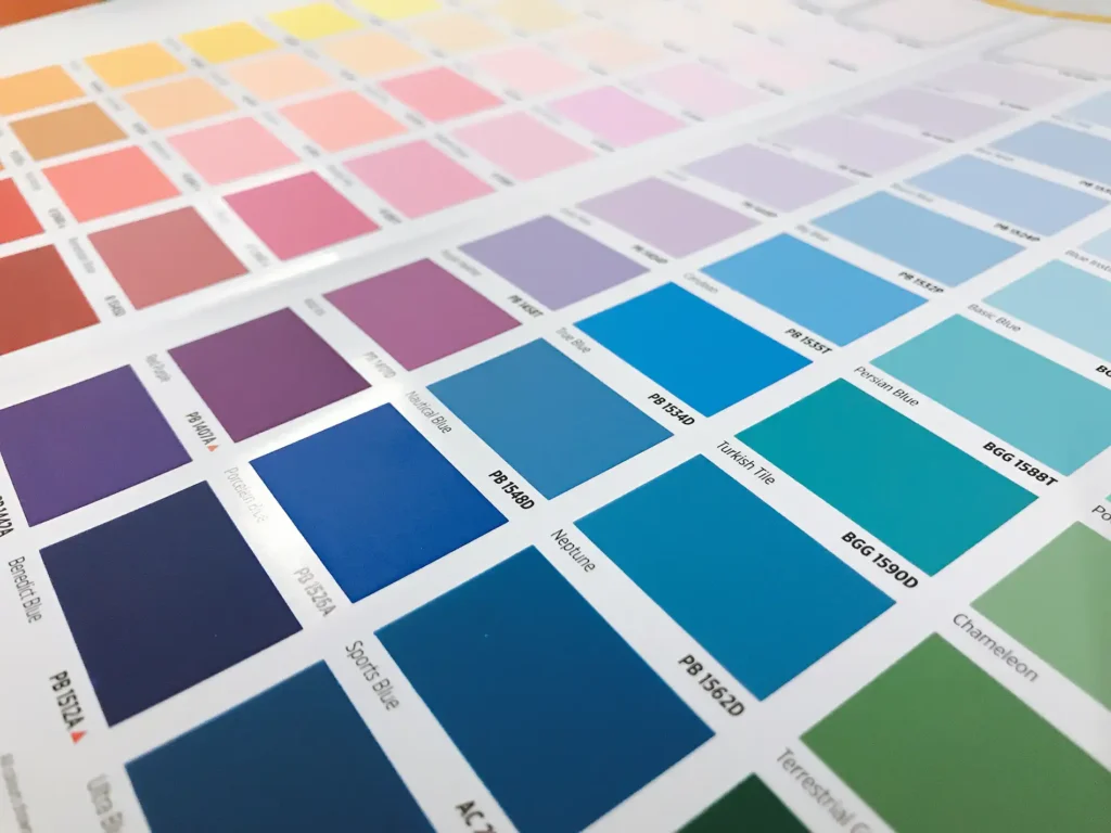
Colour flow is not about using the same colours everywhere. It is about choosing shades that share a similar family of undertones so they sit comfortably together. A warm neutral pairs easily with earthy greens, rich browns, muted terracotta, and even soft pastels. A cool neutral suits blue greys, deeper navy tones, and certain greens that carry a cooler base.
Repeating a tone two or three times in a room can also help. A soft green on the wall might appear again in the curtains and then again in artwork or cushions. This creates balance and avoids the feeling of a single random colour floating alone in the space.
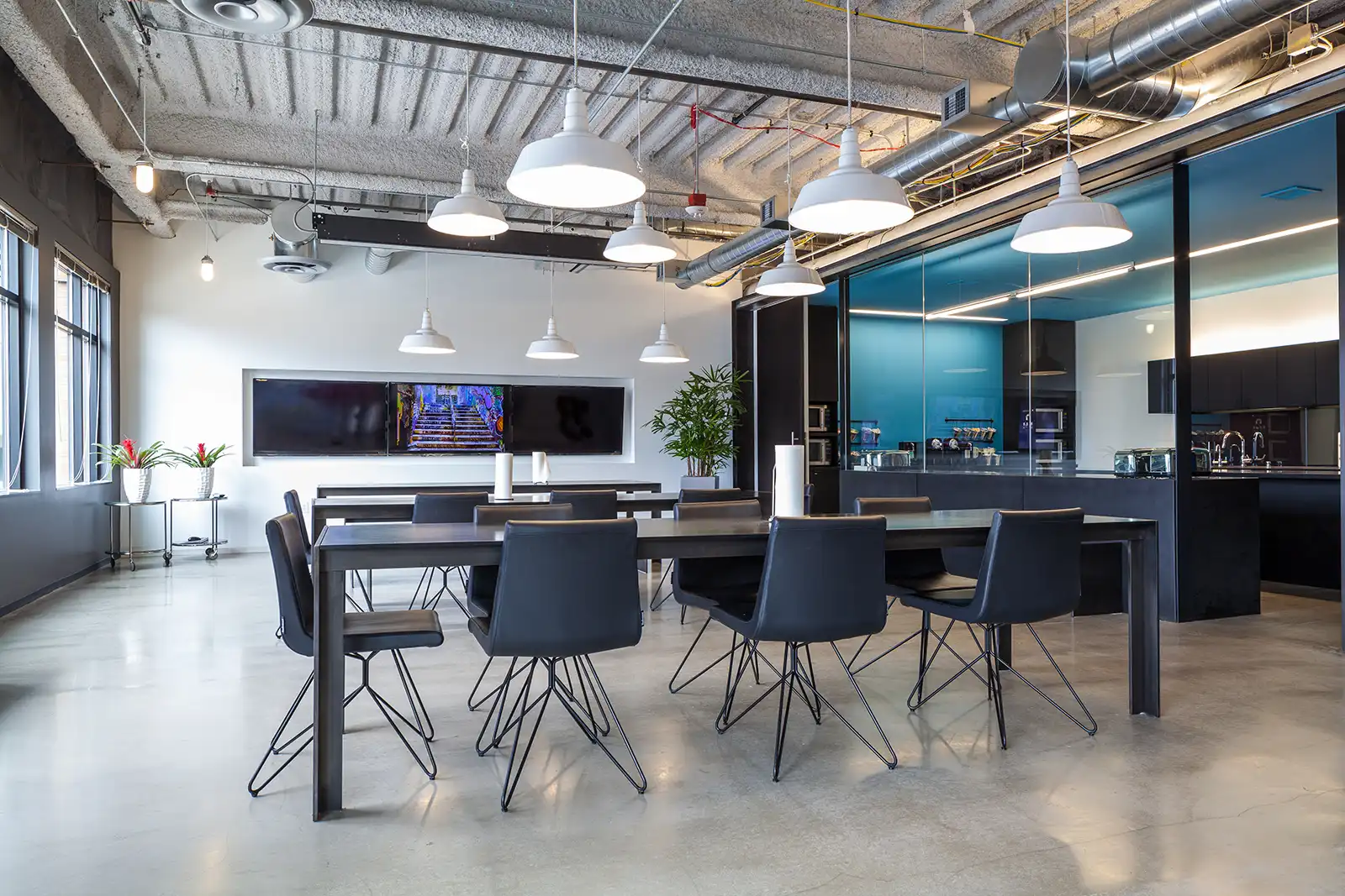
planning a redecoration
Think about mood as well as colour
Colour psychology can guide you without ever becoming rigid. Blues and greens usually create calm and focus. Earthy tones build warmth and relaxation. Deeper reds or burgundy create richness and intimacy, especially in dining rooms or cosy lounges. Yellows and warm creams bring comfort and openness. Soft purples or lilacs add a sense of gentle quiet.
The key is to match the mood to the room’s purpose. A bedroom rarely needs high energy. A home office rarely benefits from heavy, sleepy tones. A living room can handle playfulness, especially if the rest of the home is calm.

Use bold colours with intention, not fear
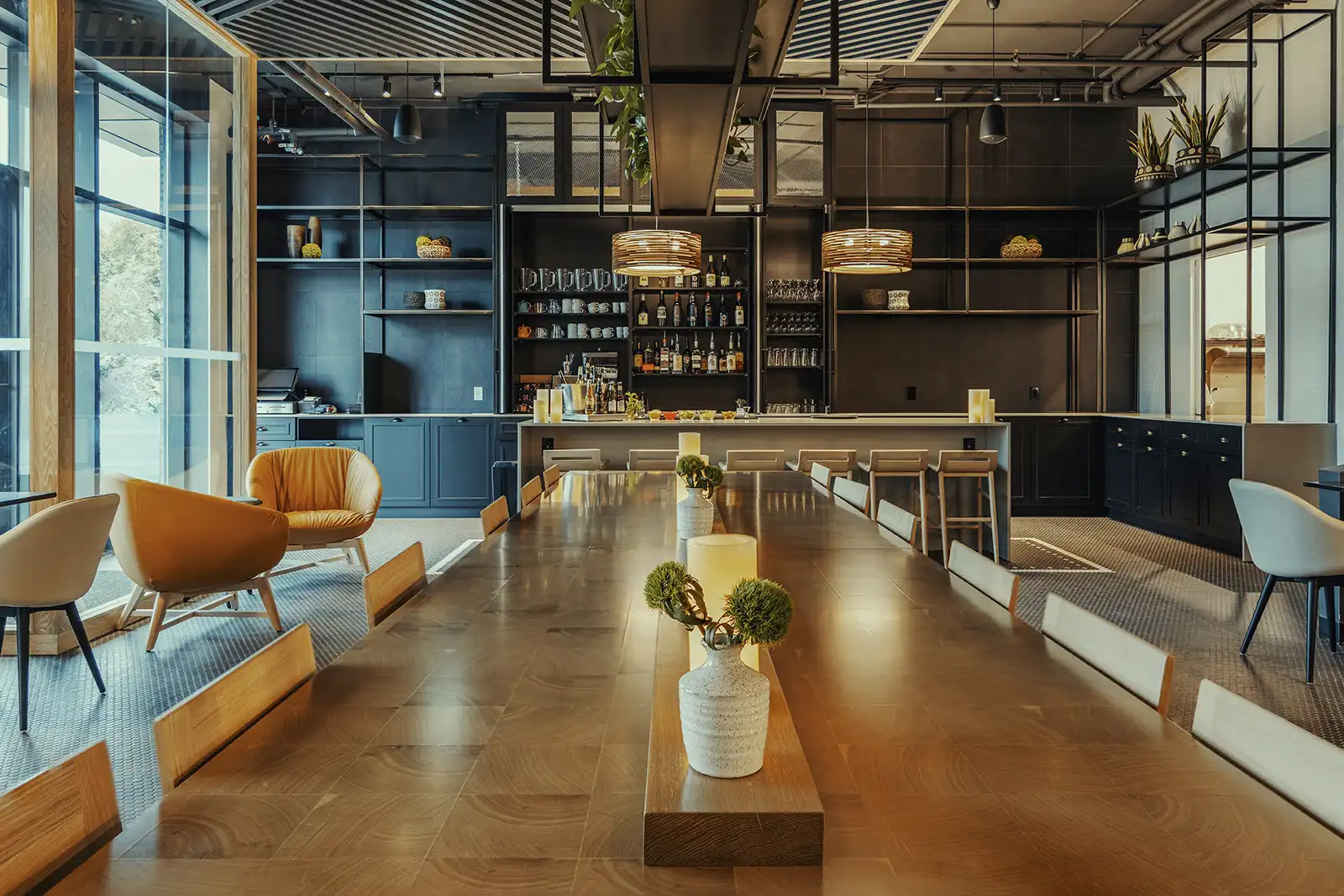
Bold colours work best when they feel deliberate. A deep navy or forest green can make a room feel luxurious rather than dark, especially when paired with warm wood, soft textiles, or gentle lighting. A jewel tone on one wall can look refined rather than loud when the furniture carries hints of the same shade. Bold choices need structure. That structure comes from contrast, texture, and repetition.
Let each room have its own personality
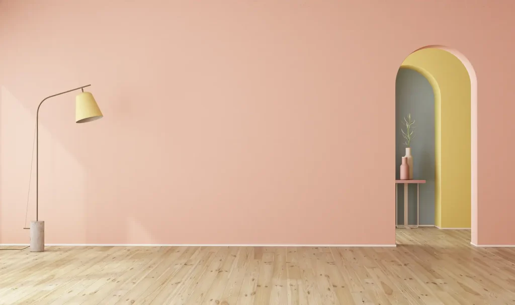
Even with a connected palette, every room should feel like its own space. A kitchen might lean into nature inspired greens. A bedroom might prefer a quiet natural neutral. A living room may carry a deeper colour to create depth and character. As long as the undertones are linked and the base neutral remains consistent, your home can support a variety of moods without losing its sense of unity.
Finish with the small details that bring everything together
Once the colours are chosen, the final layer is what makes the room feel finished. Lampshades, artwork, cushions, throws, window treatments, plants, and even decorative books all help carry the palette through the room. This is the stage where everything begins to make sense, and the personality of the home becomes visible.
Fineline Decorators help clients across Plymouth create homes that flow beautifully from room to room. When colour is chosen with intention, every space feels more inviting and more comfortable to live in.
